
Limited Edition Book Design
Created, designed, and handmade a Limited Edition version of Pride and Prejudice in March 2021 as part of a Book Design Technology course. The course was taught virtually by Lorraine Donegan in the Graphic Communication Department at California Polytechnic State University, San Luis Obispo.
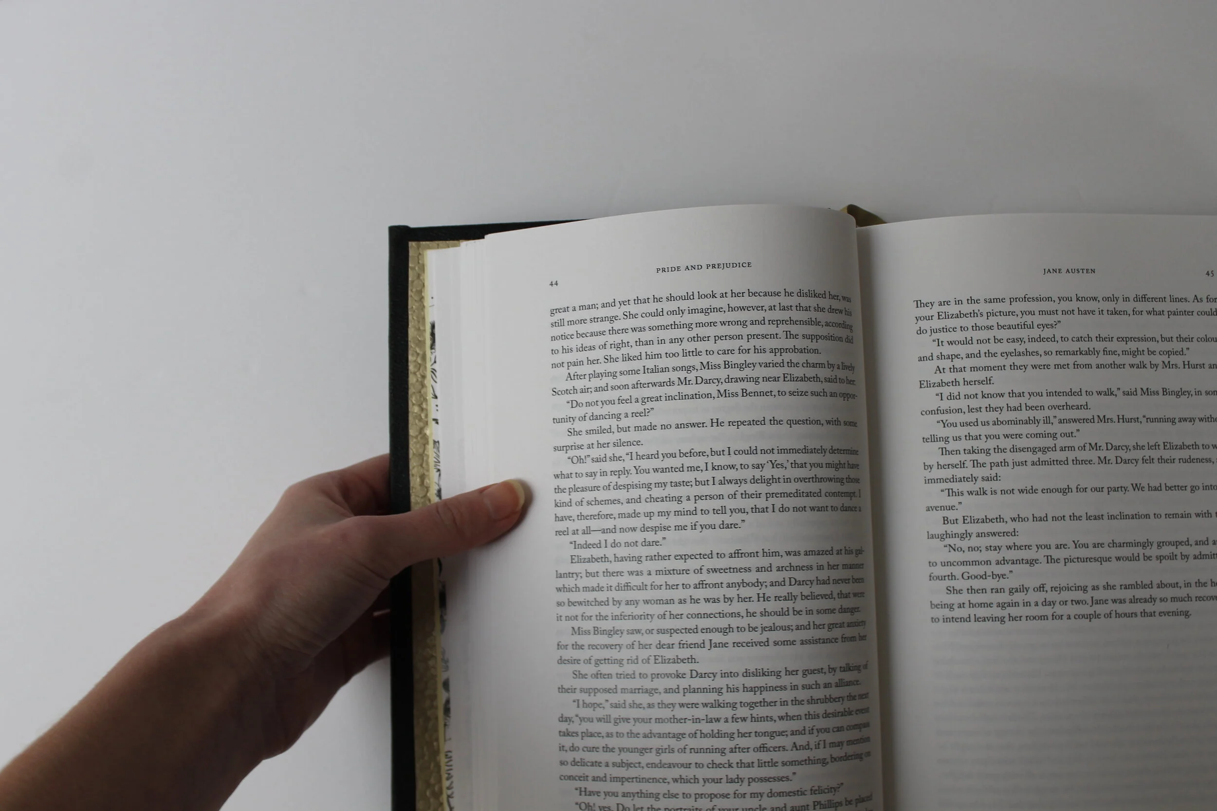
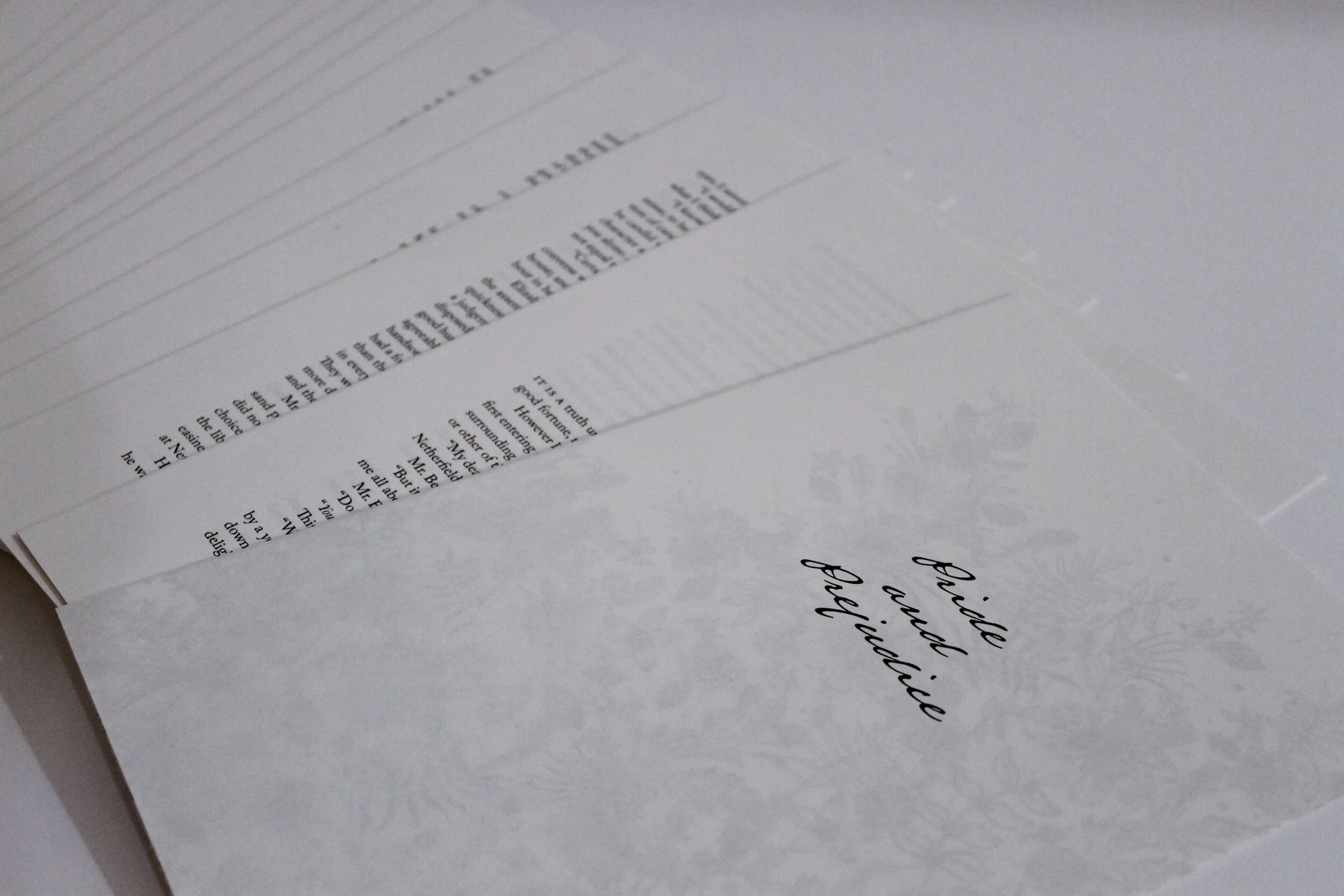
The typeface used for the titles, volumes, and chapter number headings is Austin Pen to imitate the type of handwriting used with a quill in the 1800s. Austin Pen replicates the hand of Stephen F. Austin in his famous 1834 Mexican prison diary. The rest of the book is set in varying weights and styles of the typeface Adobe Caslon Pro, including Adobe Caslon Pro Small Caps. Adobe Caslon Pro was designed by Carol Twombly, who studied specimen pages printed by William Caslon between 1734 and 1770.
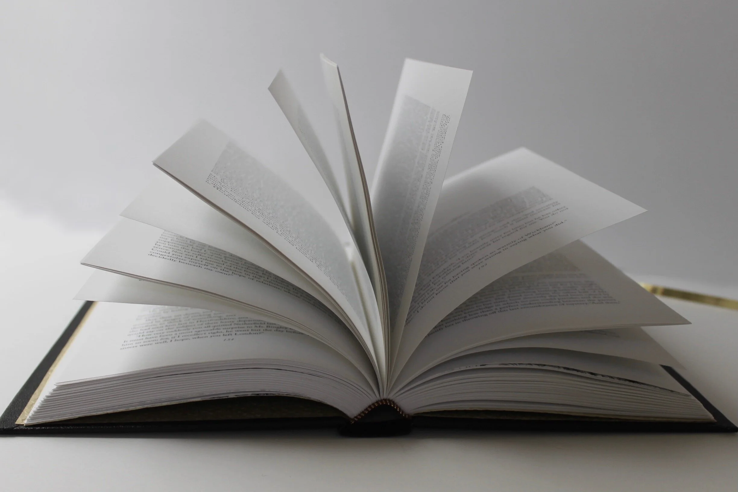
The book was designed using Adobe InDesign CC 2021 on a 2017 MacBook Pro. It was printed on French Paper Sweet Tooth Pop Tone 70lb text and output by University Graphic Systems on a Xerox Color800 digital press.
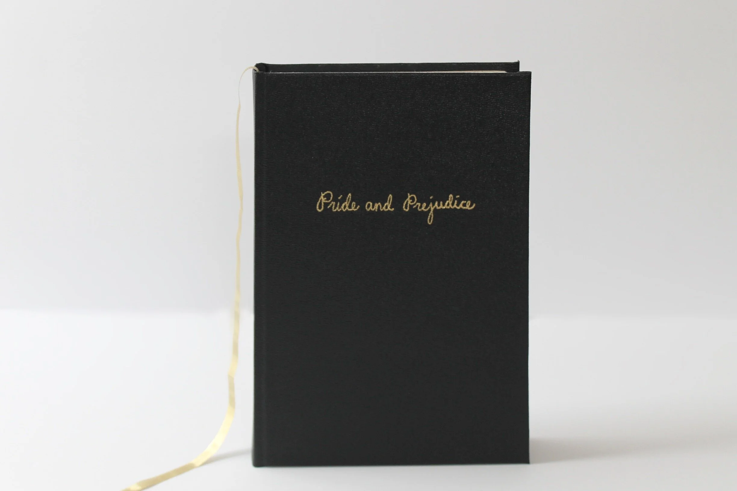
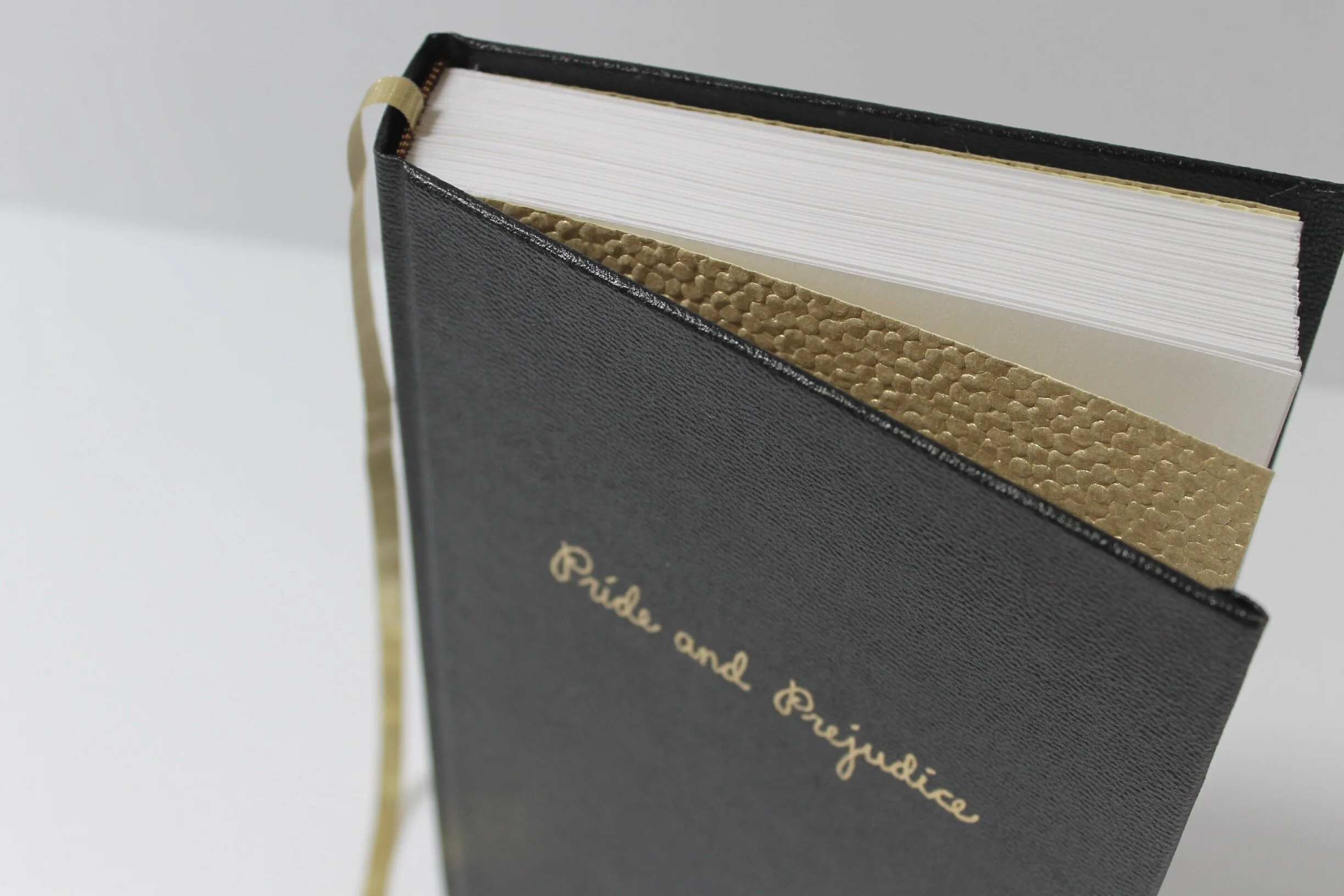
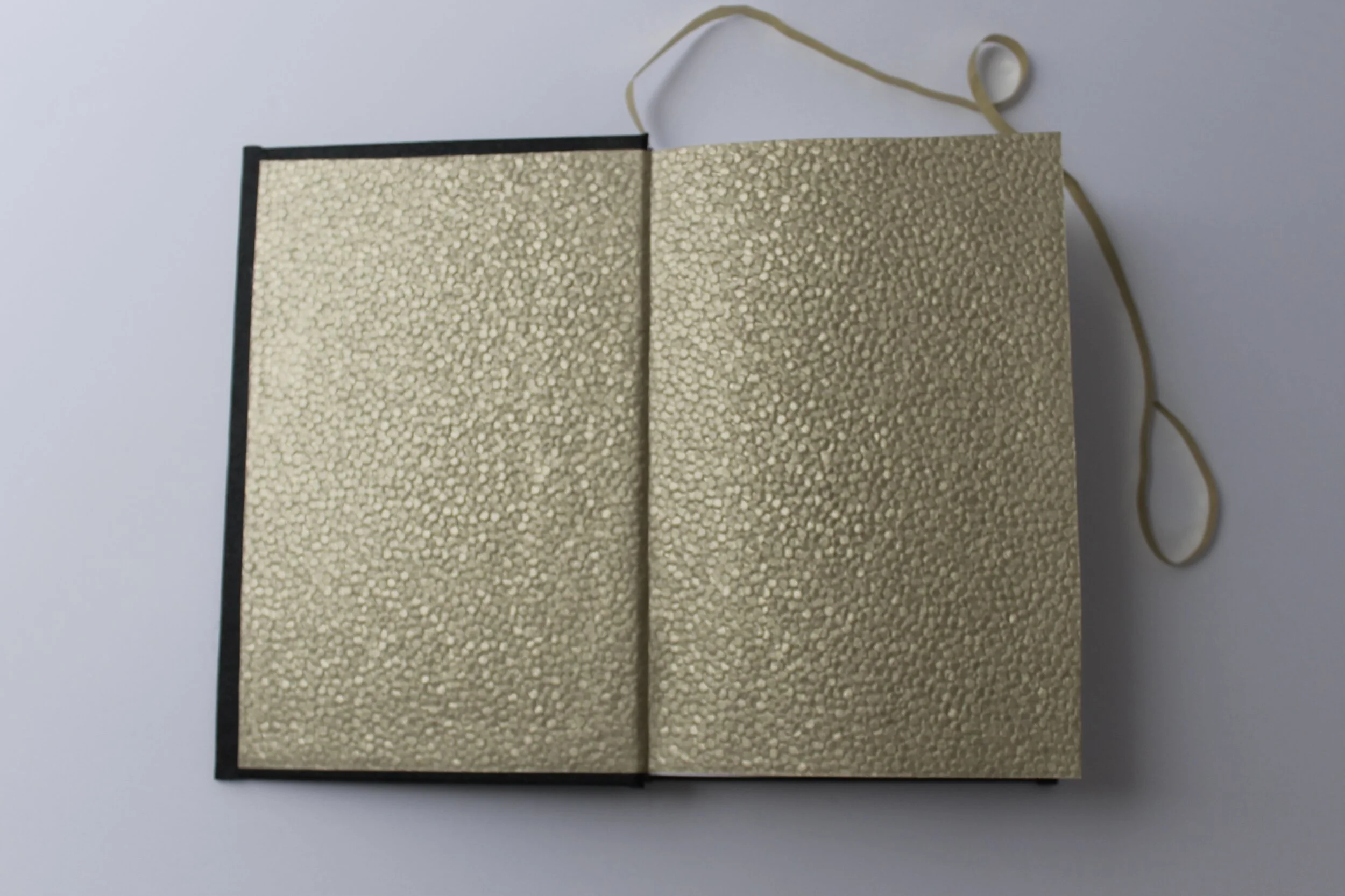
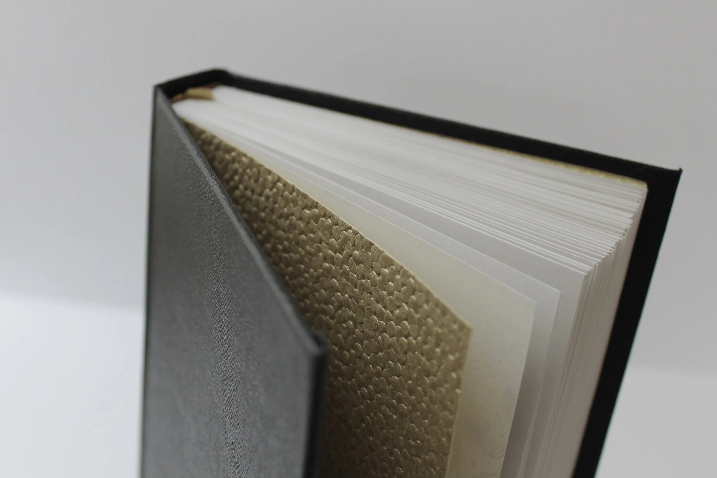
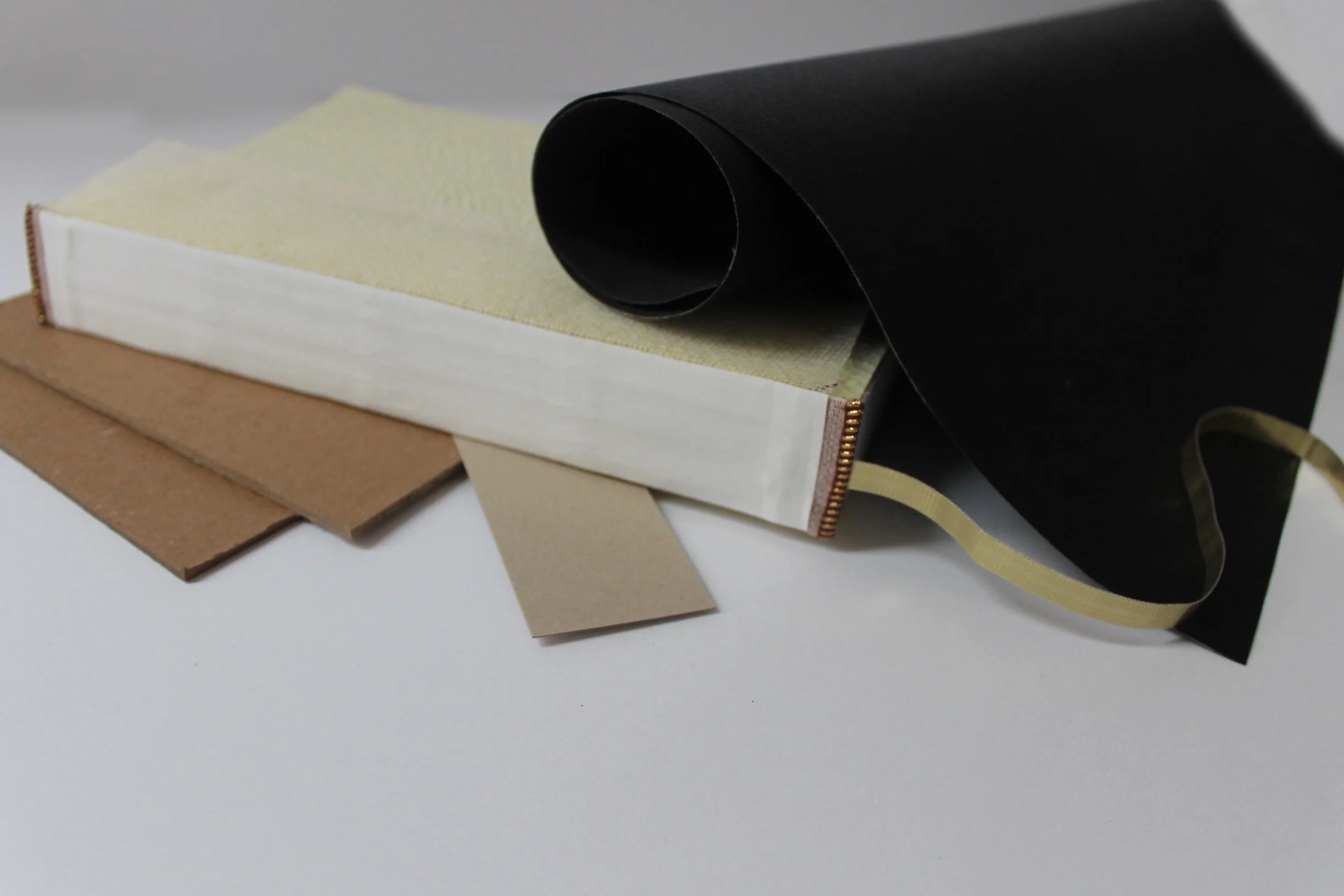
All materials were purchased at Art Central in San Luis Obispo. The cover features black faux-leather book cloth and a hand written title using a gold paint pen.
Design Process
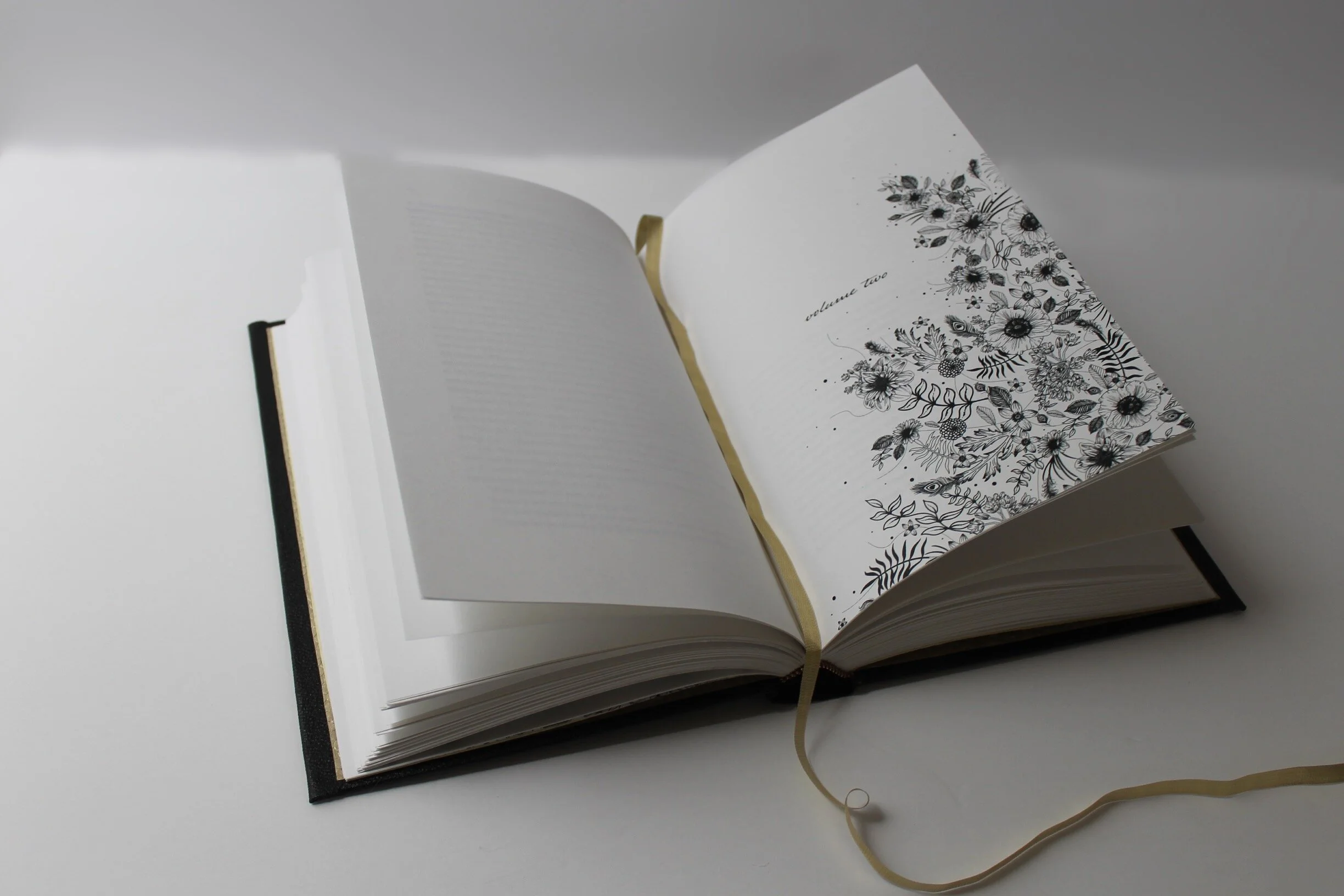
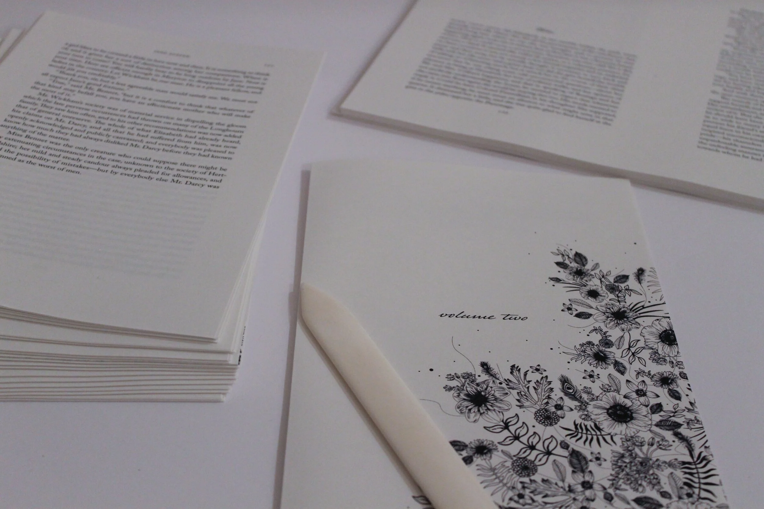
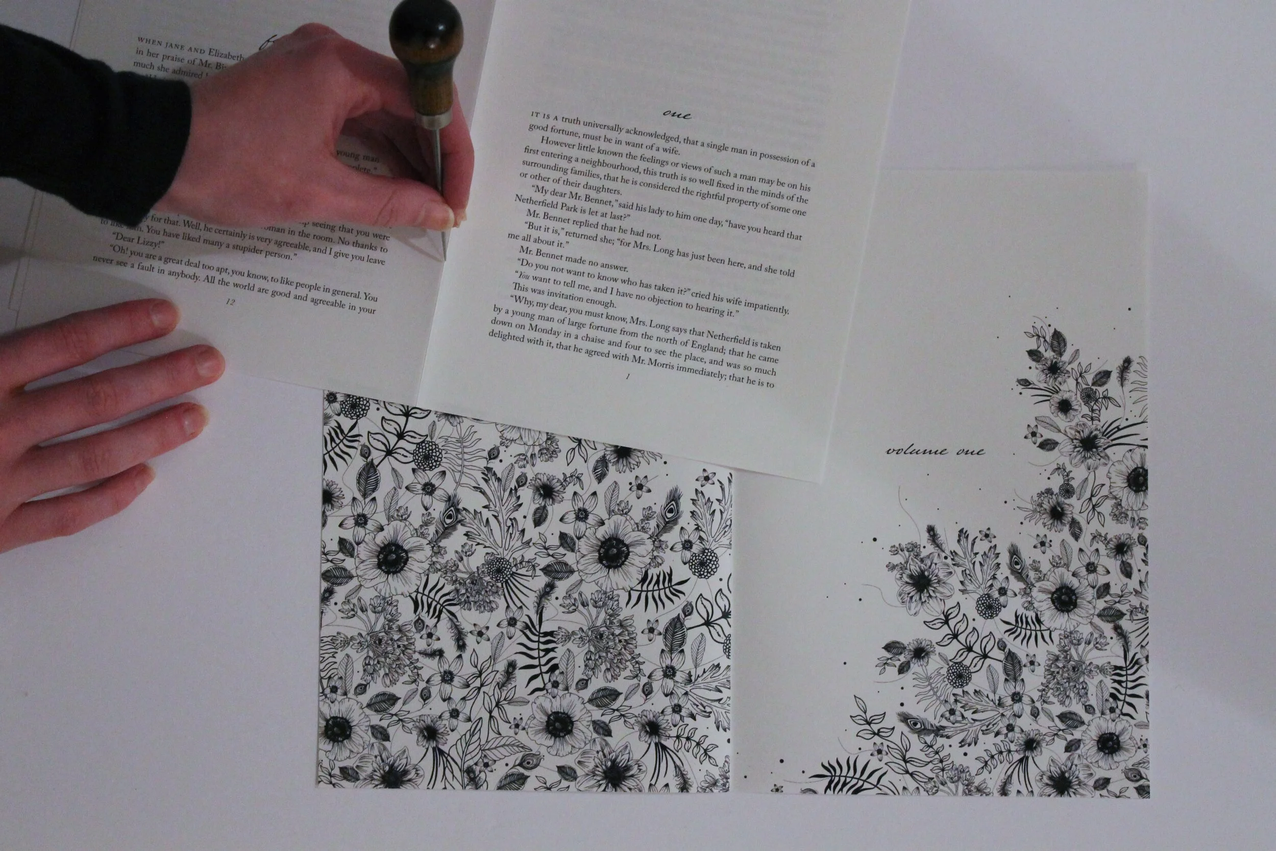
The first step of the process was finding the plain text file for Pride and Prejudice, with no formatting. I had to do major editing to this text file before it was usable. I then imported the text file into Adobe InDesign and designed each page of the book. Using Adobe Illustrator, I created a floral illustration that is repeated on the title page and volume openings. Once the file was preflighted and ready to print, I oversaw the printing process at University Graphic Systems and used the polar cutter to cut the pages down to the correct size. It was printed on French Paper Sweet Tooth Pop Tone 70lb text and output on a Xerox Color800 digital press.
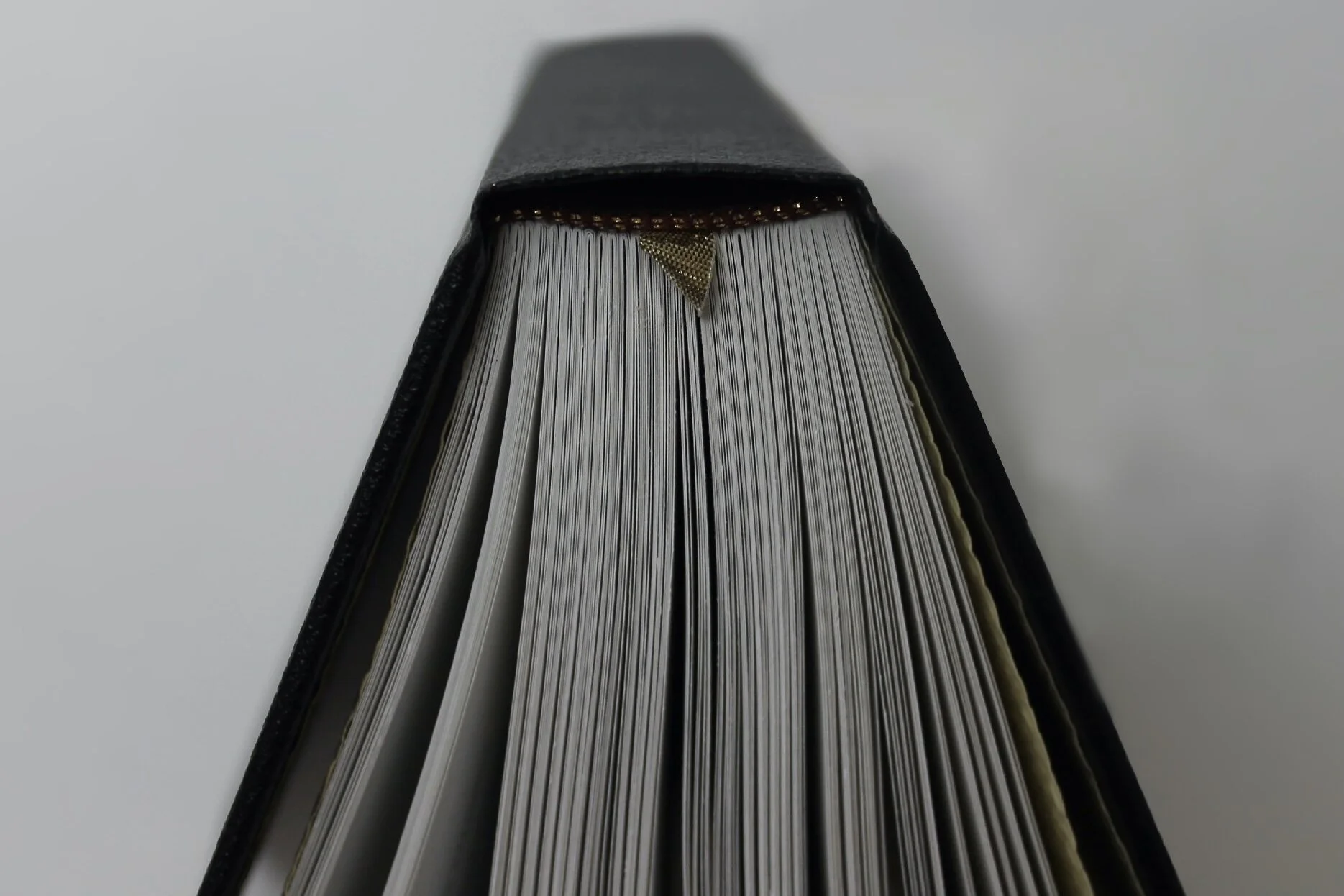
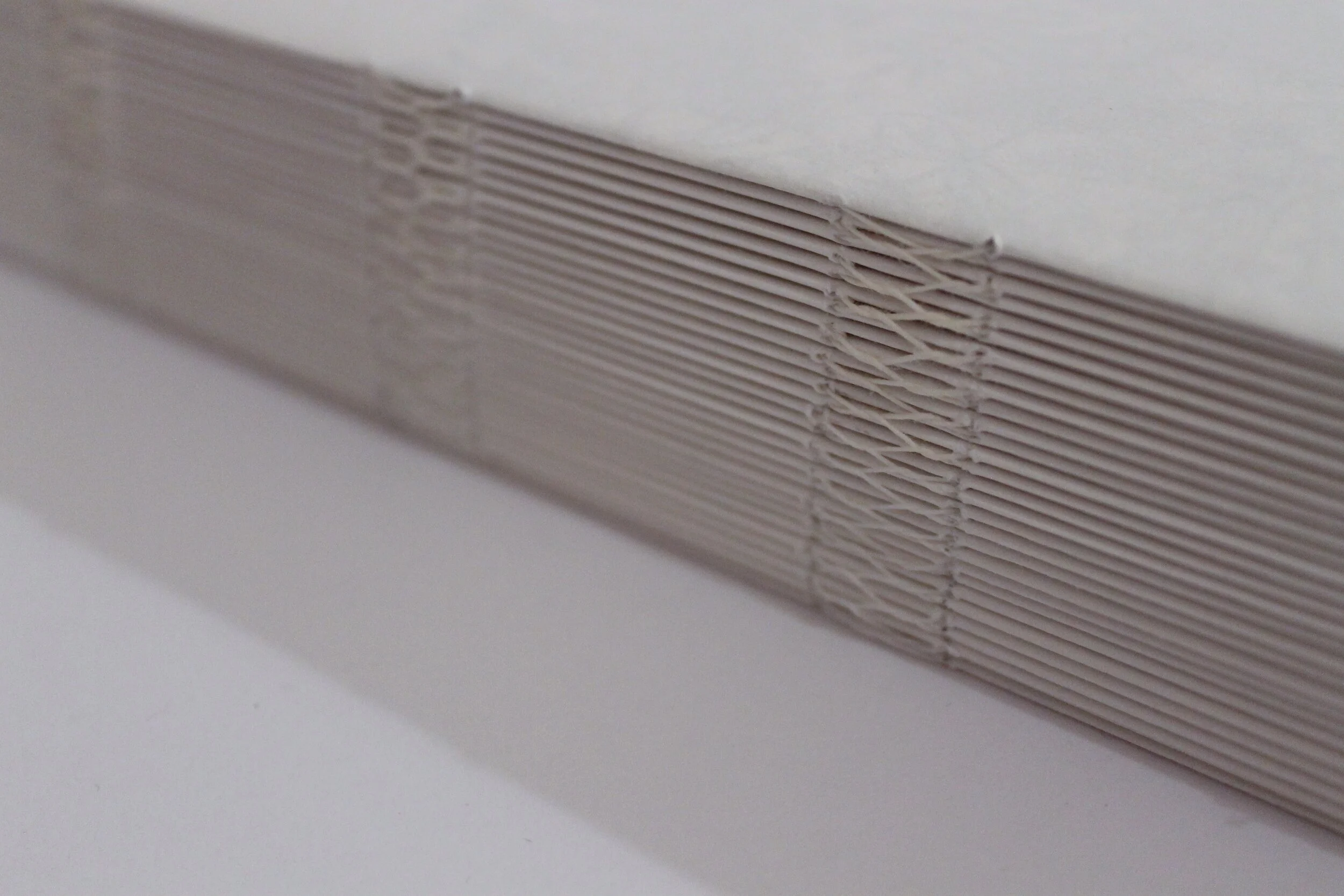
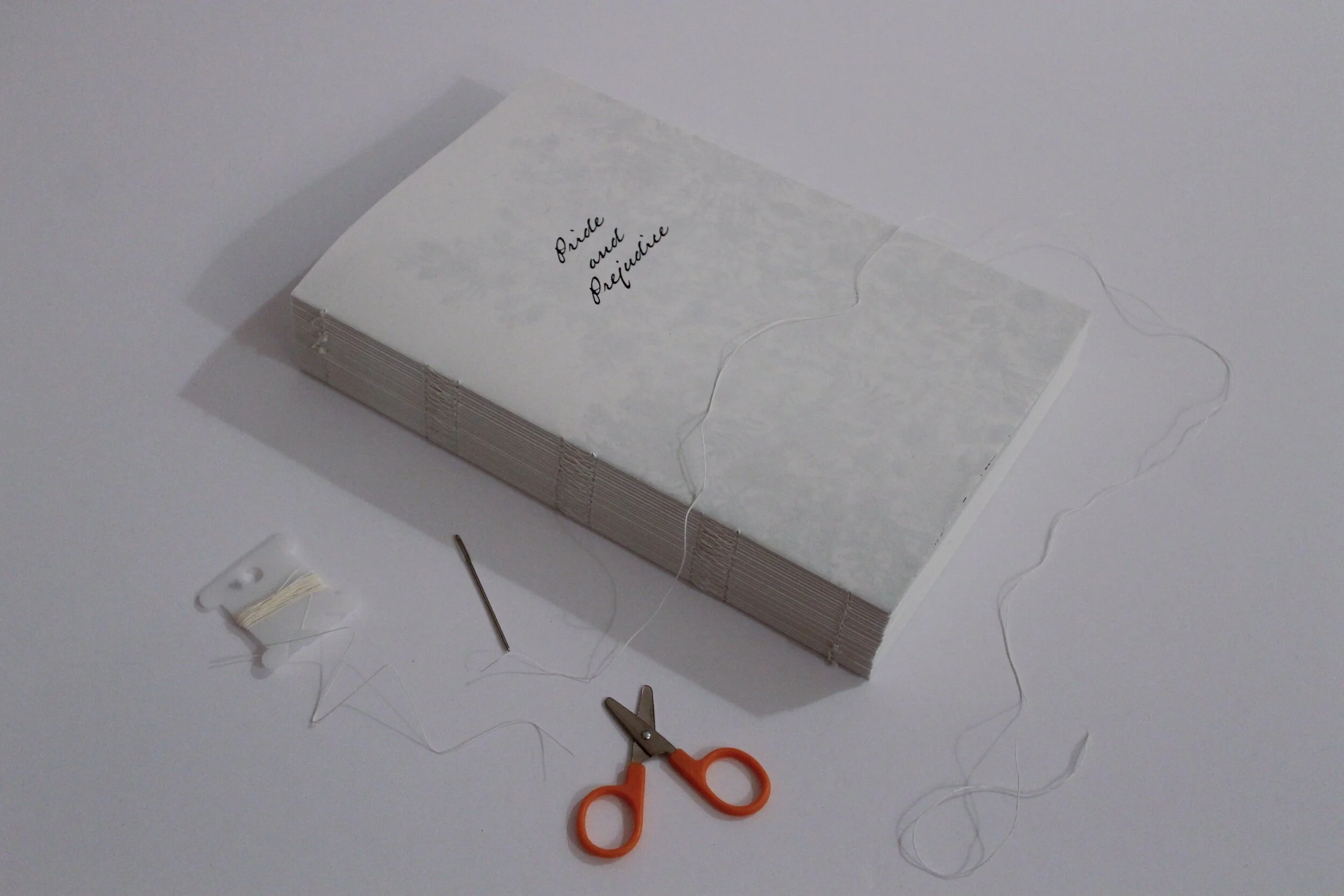
Once all the pages of the book were printed, I individually hand folded each page in half with a bone folder tool. Then I created signatures by placing 3 sheets inside of each other. I then used a bookbinding awl to create 8 holes in each signature along the fold. These holes are in the same exact place on each signature in order to be properly stitched together.
I used a butterfly stitch to hand stitch each signature together. I also incorporated a book weight into the process to create a distinctive crease for the spine and ensure all signatures were tightly together.
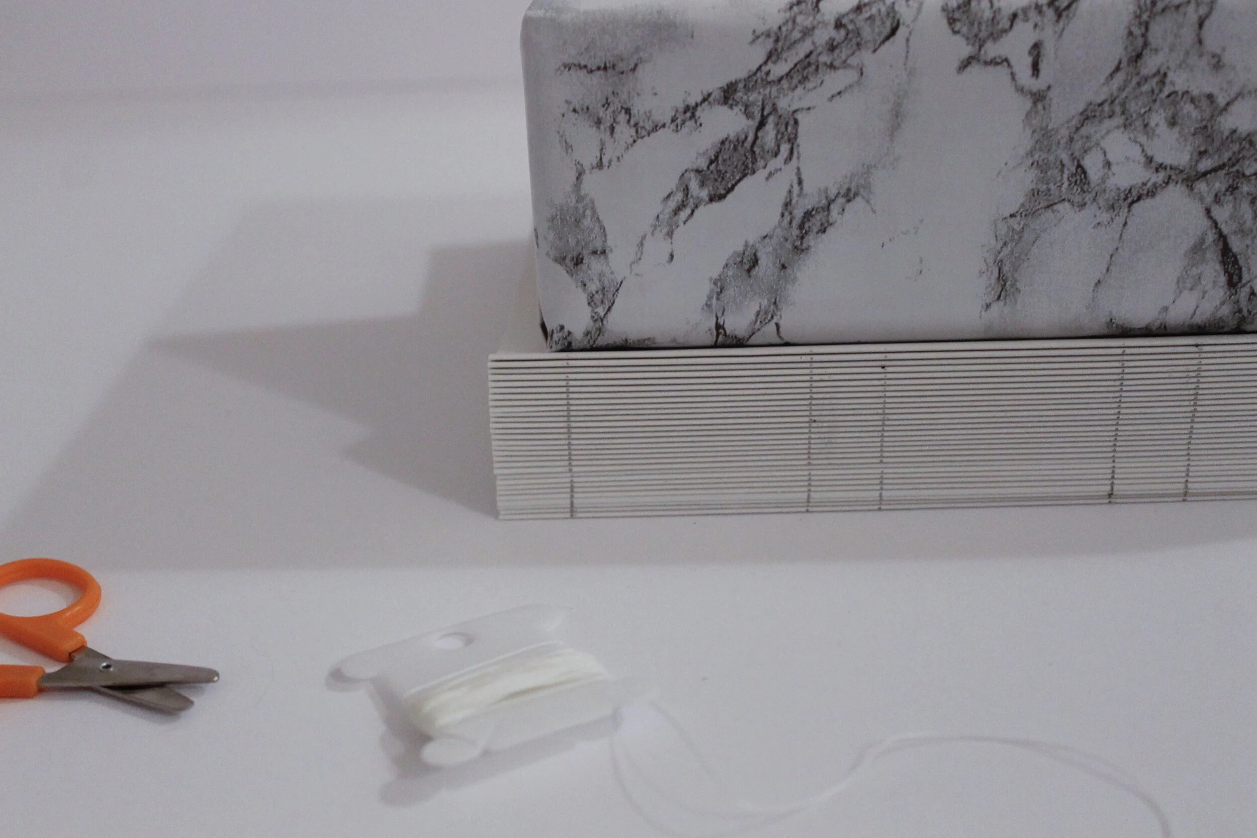
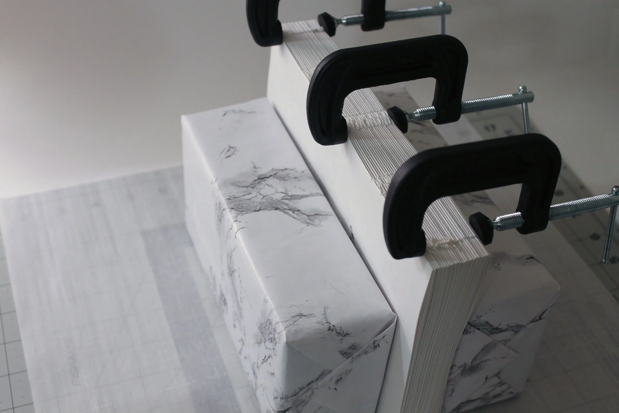
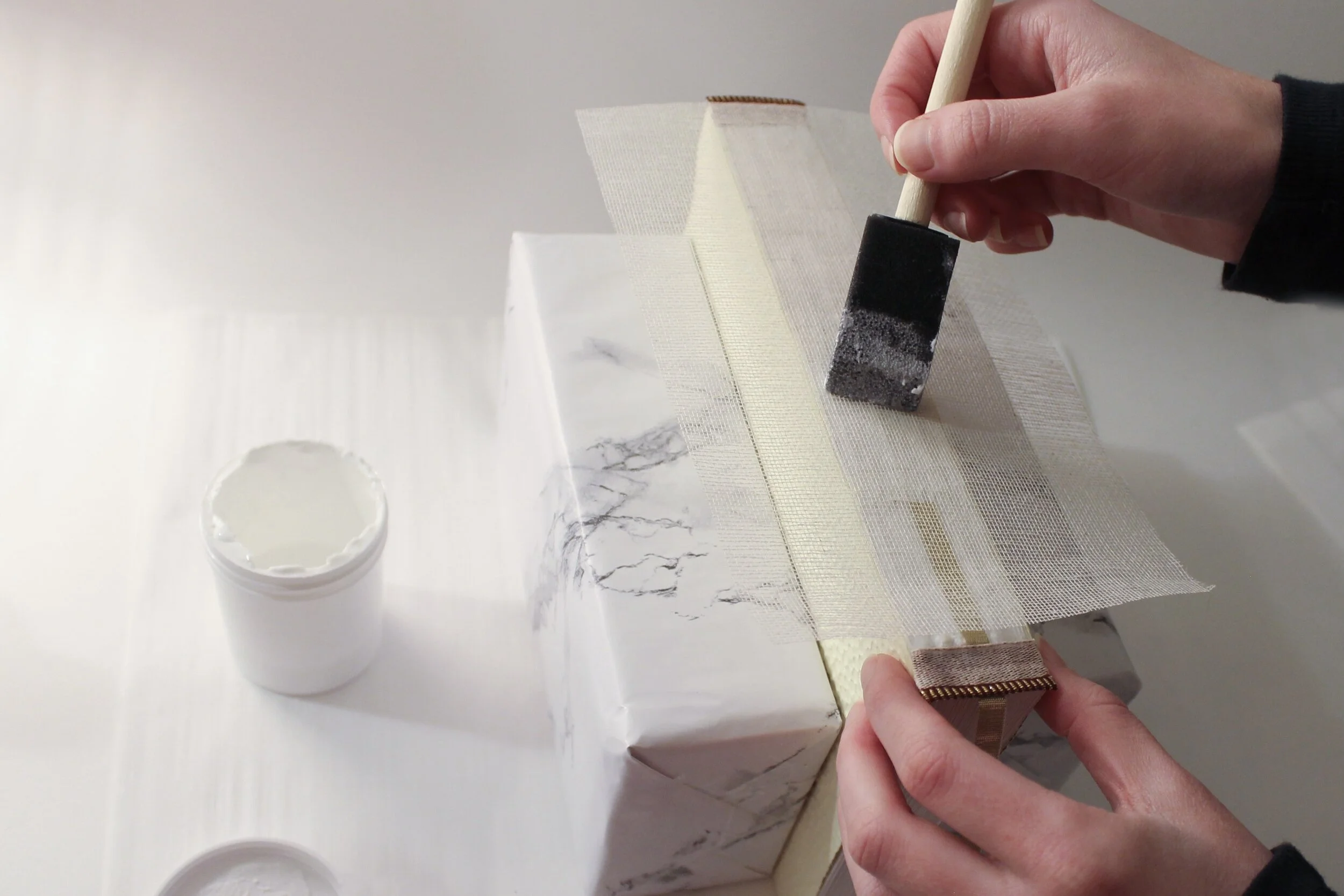
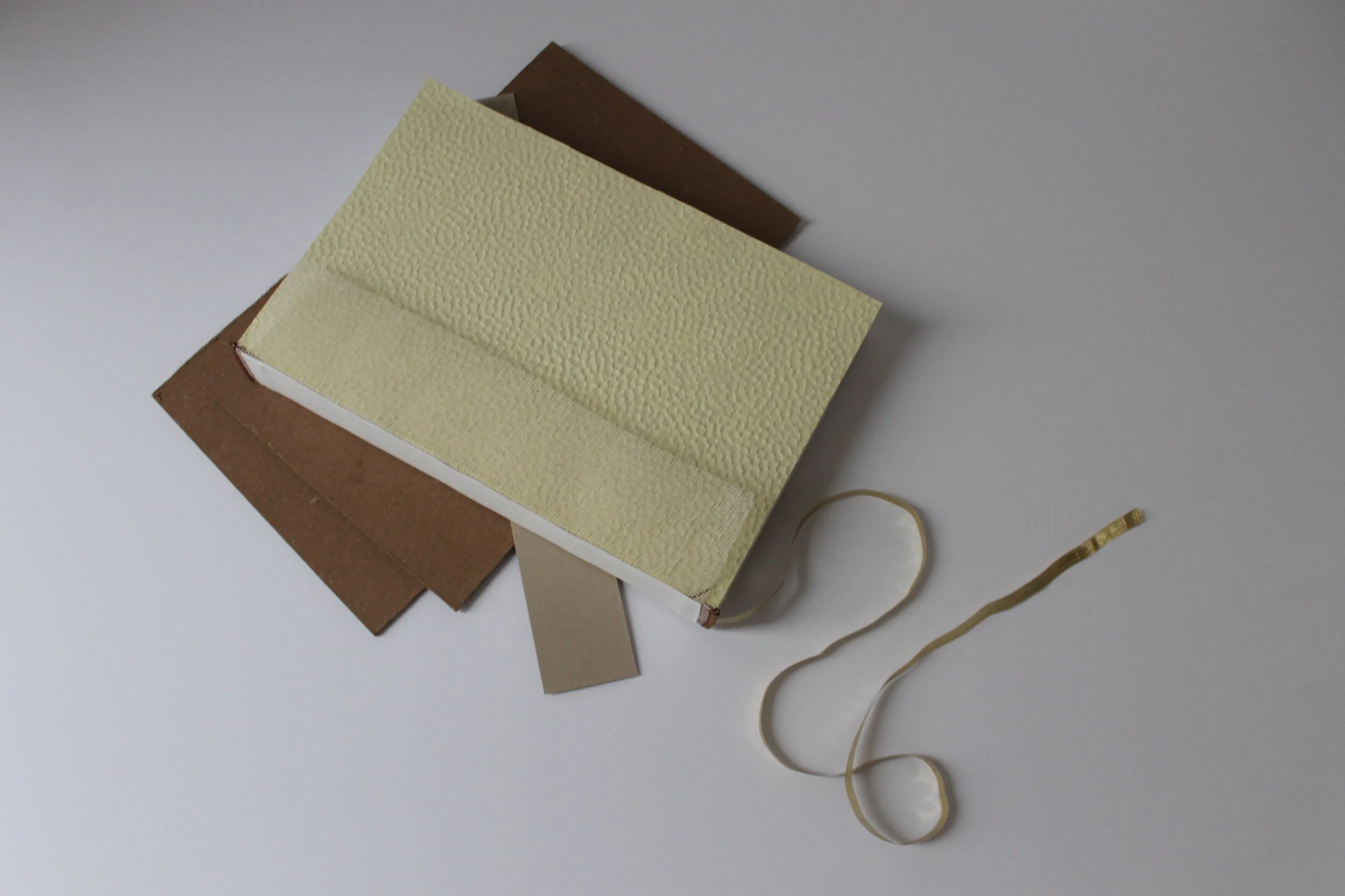
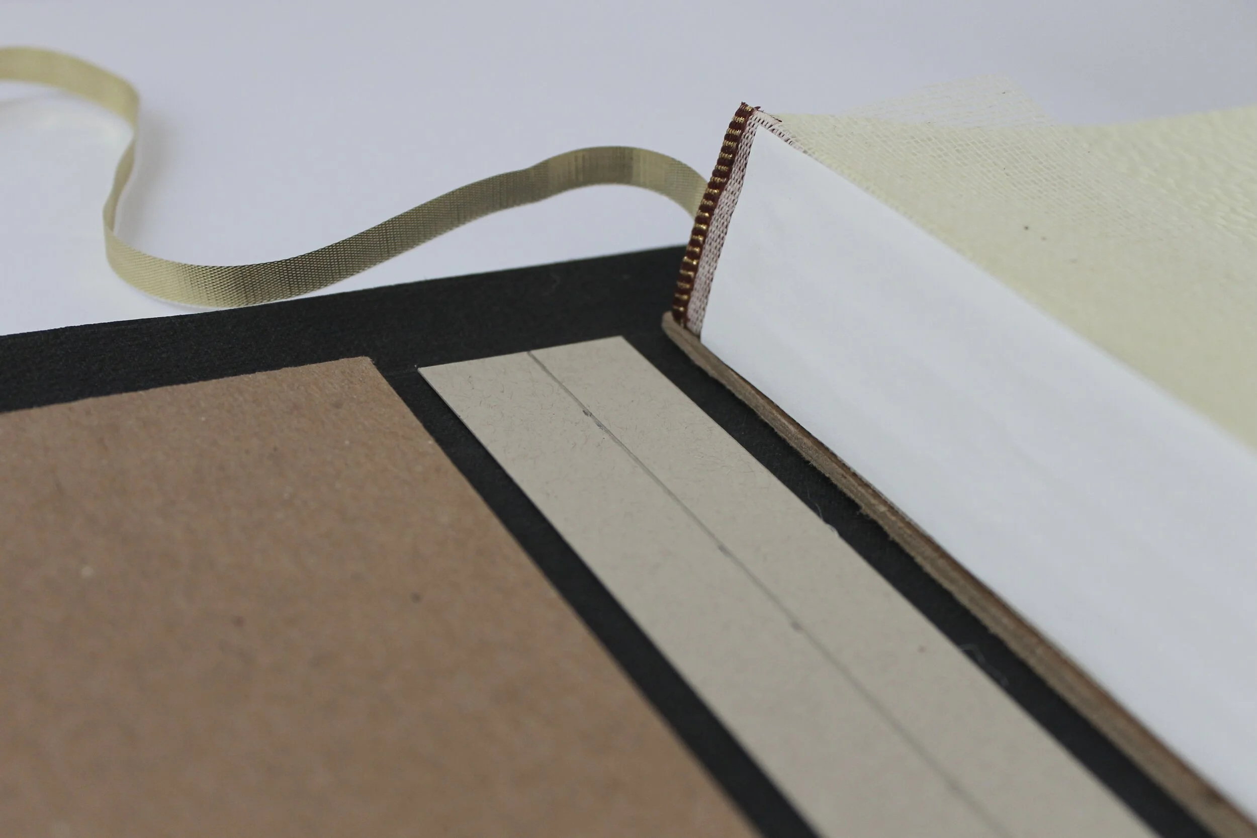
After stitching all the signatures together, I coated the spine in book making glue and used clamps to hold everything together firmly. After the first coat, I places the headband and ribbon onto the book block and applied more glue. Once dried, I attached mull to the spine, which eventually creates the connection between the book block and the book board.

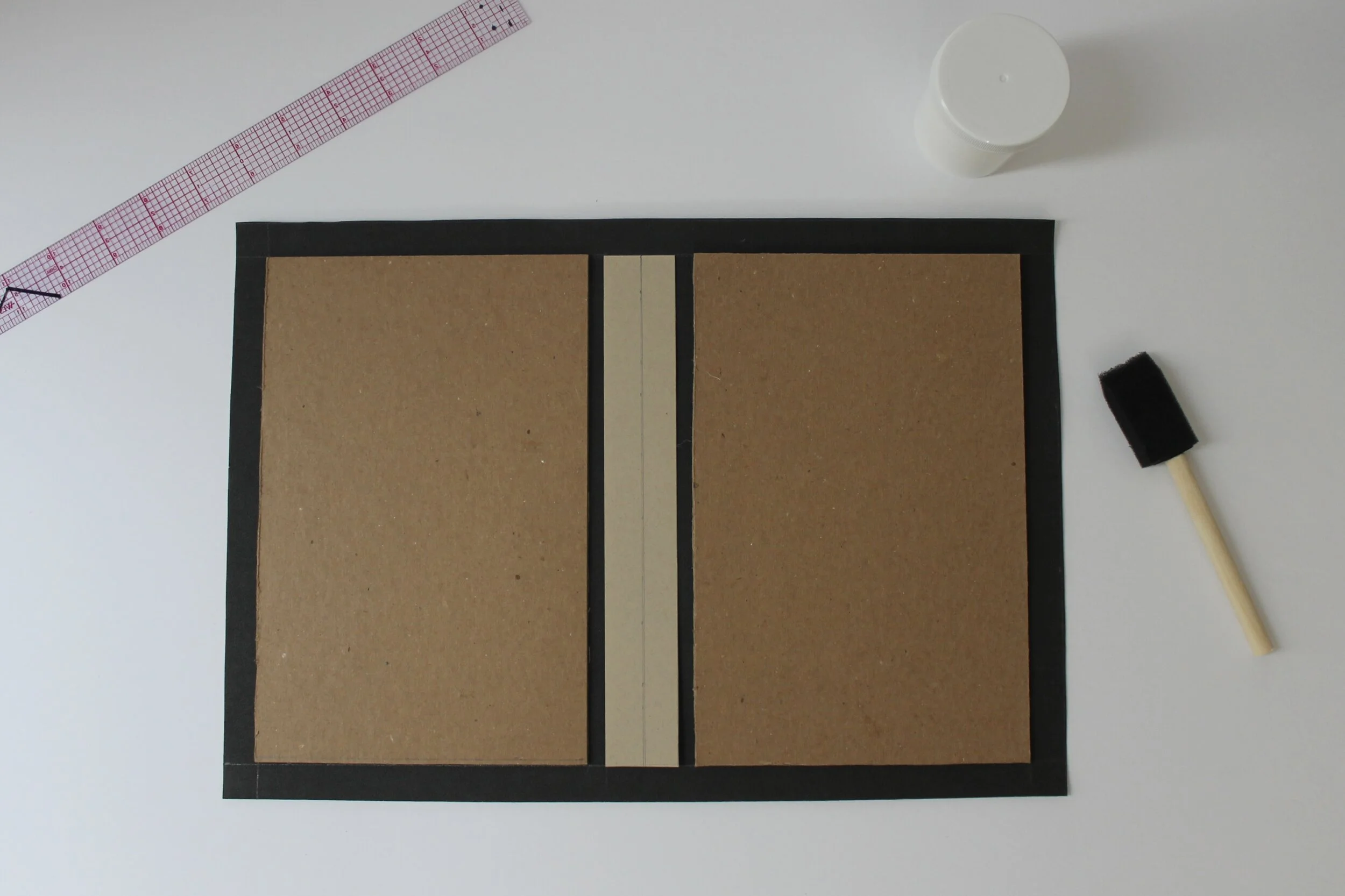
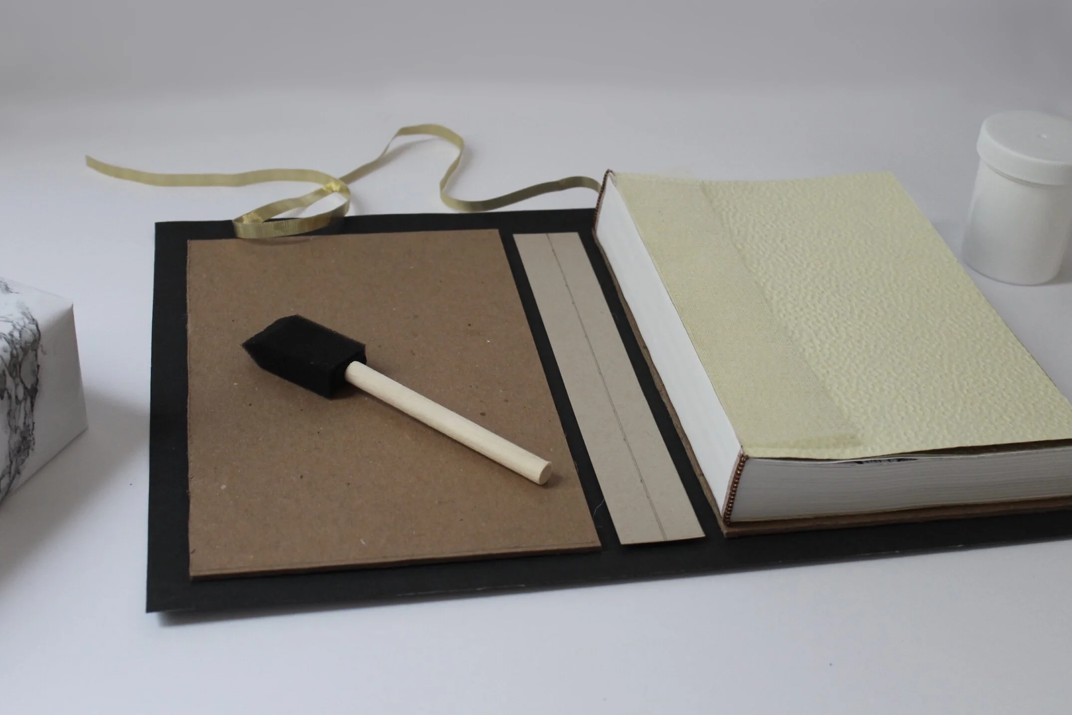
I gathered all my materials in order to create the spine board, book board, book covering, and end sheets. These were all cut down to the appropriate size.
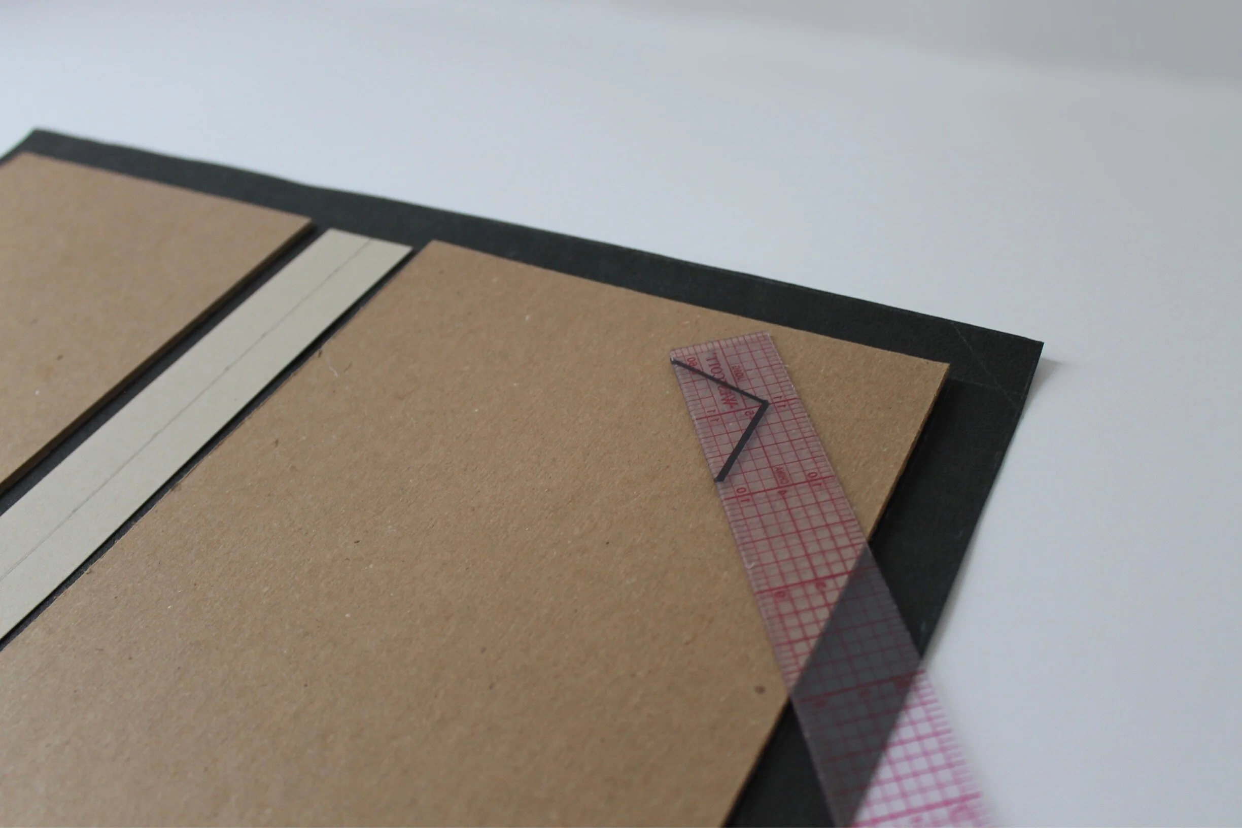
After all materials were cut down and placed properly, I folded the excess edges of the book cover over the book board to create a clean edge. The final step was gluing the end sheets to the book board and letting it sit for over 24 hours.
The finished product. Through this process I further developed my skills in book design, production, design principles, illustration, typography, and overall print design.
